Editors Note: Welcome to our newest bi-weekly column, Classing Up Cannabis. Consider this your go-to spot for fluid, applicable advice regarding the image, design, marketing, and branding of your cannabis business. Right now, most of the content in the cannabis zeitgeist neglects to highlight or speak to the minds behind businesses—you know, those fueling the industry. Whether you’re just launching a brand or your long-time business has weathered the transitional storm of complex regulation, we dedicate this column to you.
When medical cannabis was first legalized in California in 1996, the concept of cannabis branding was essentially non-existent. Dispensaries looked less like retail stores and more like back-alley speakeasies with bars on the window and a generally uninviting atmosphere, accented by packaging products in Ziplock baggies.
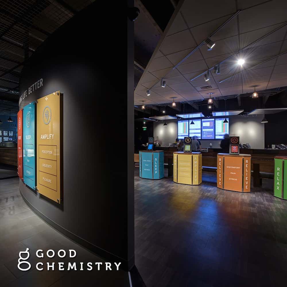
Fast-forward twenty years, and the landscape is drastically different. Instead of being sketchy holes in the wall, most dispensaries resemble Apple stores. So, what happened? How did cannabis dispensaries change, and what are the design elements that prospective dispensary owners can implement in their stores? If you’ve ever asked yourself these questions, we’ve got answers for you.
Great Lighting
Good dispensary design starts with good lighting. When the first handful of cannabis dispensaries opened their doors in the late ‘90s, most were illuminated with harsh fluorescent lights that glared in customers’ eyes and made everything feel and look dingy. Most contemporary dispensaries have done away with hospital lighting in favor of a more pleasant experience.
In order to create a more pleasant lighting experience in your cannabis dispensary, try and utilize the three types of lighting: ambient, accent, and task lighting. Ambient lighting is used to illuminate the room, usually in the form of recessed lighting. Task lighting, on the other hand, performs a specific purpose and often appears in the …
Read More
Author: Jared Mirsky / High Times


